MinhoQueens
LGBTQIA+ Collective
LGBTQIA+ Collective
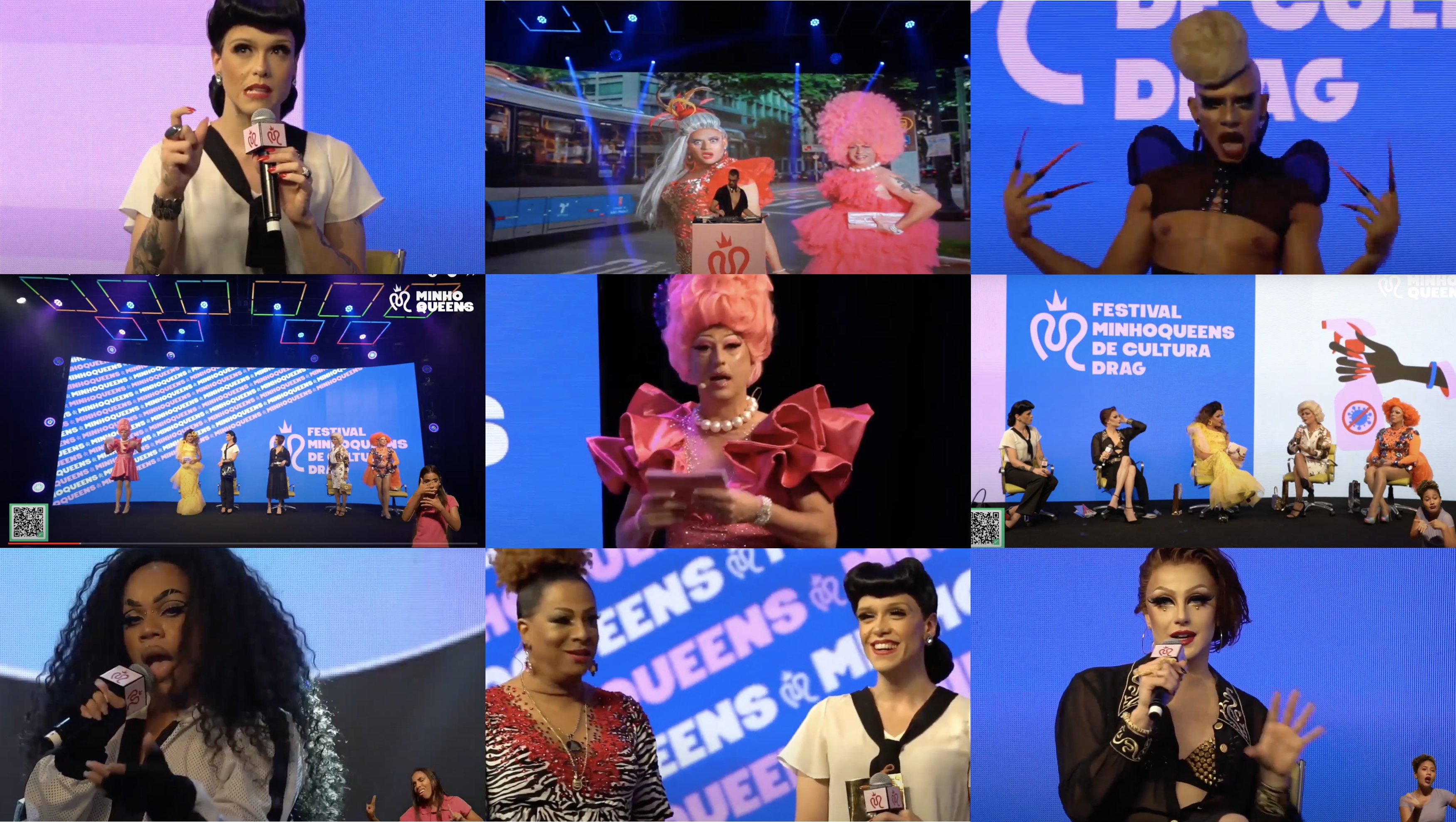
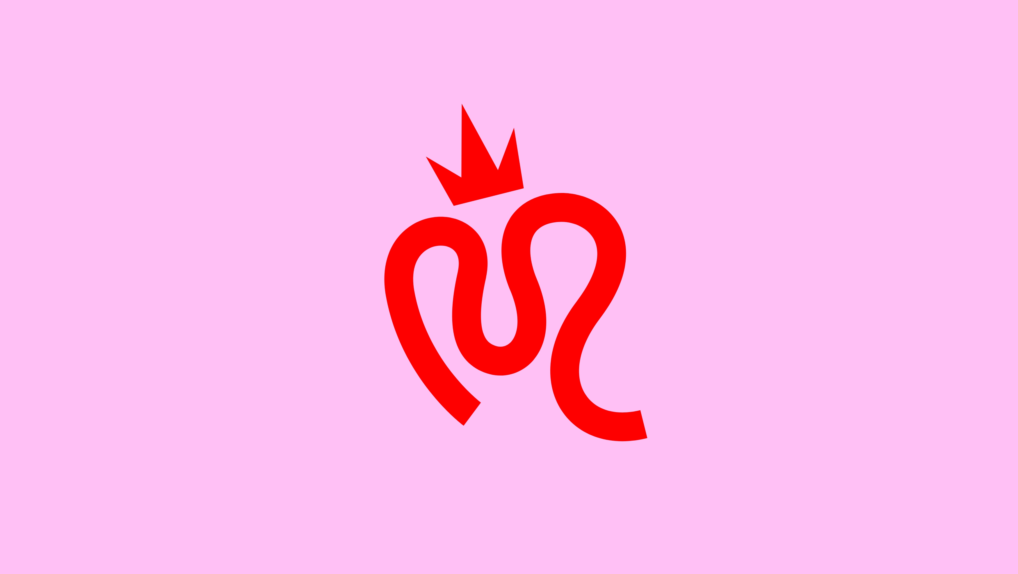
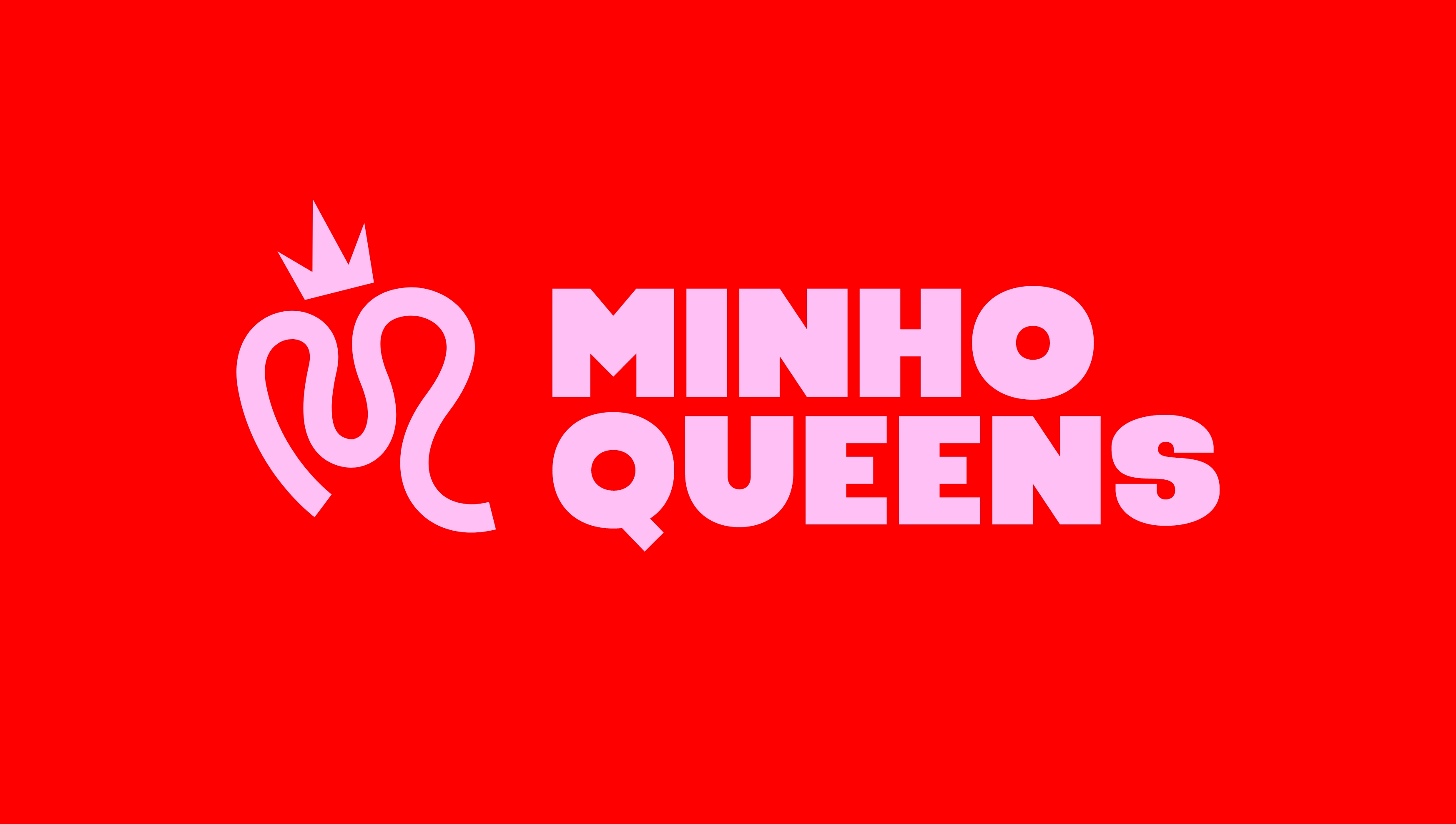
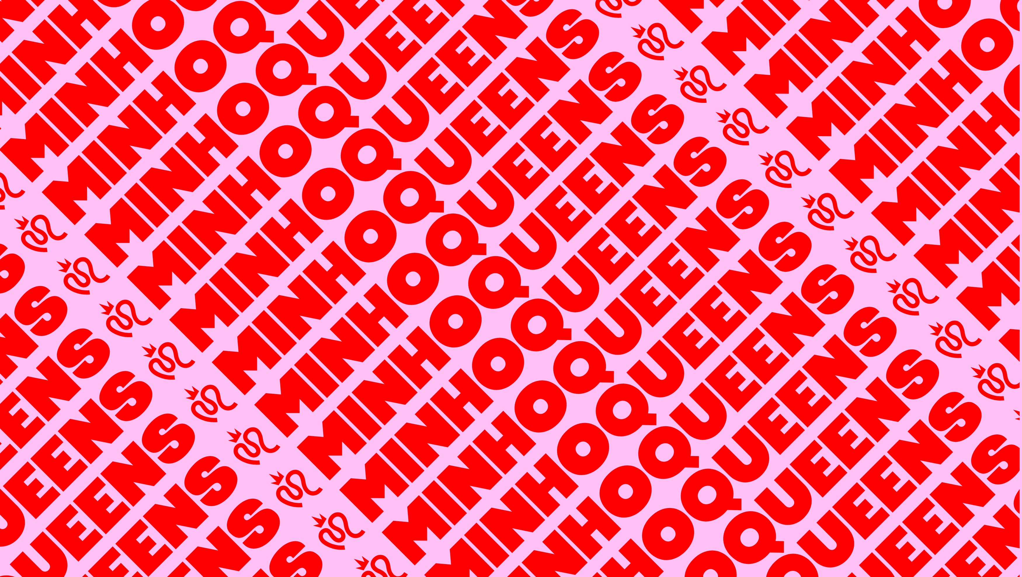
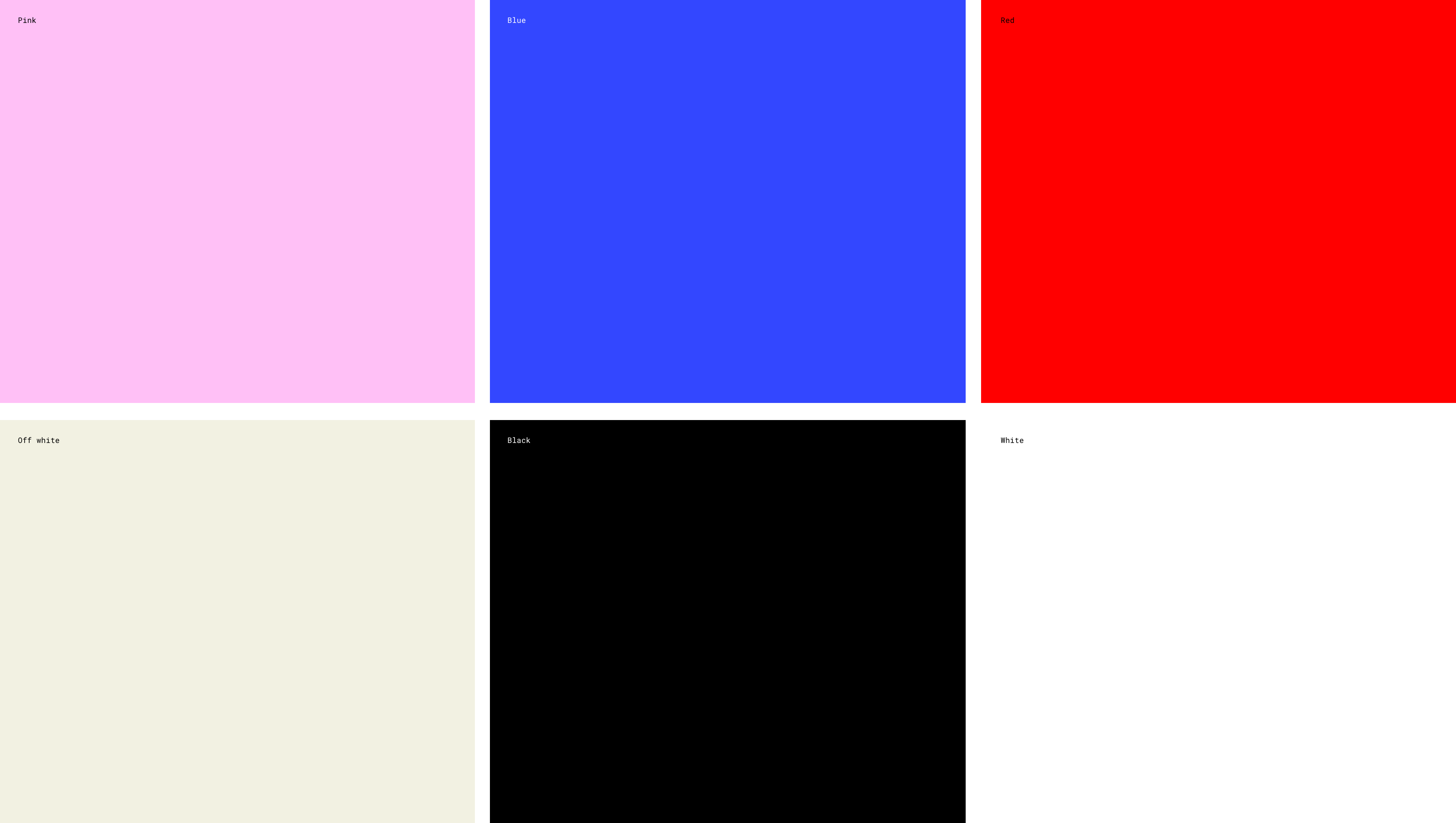
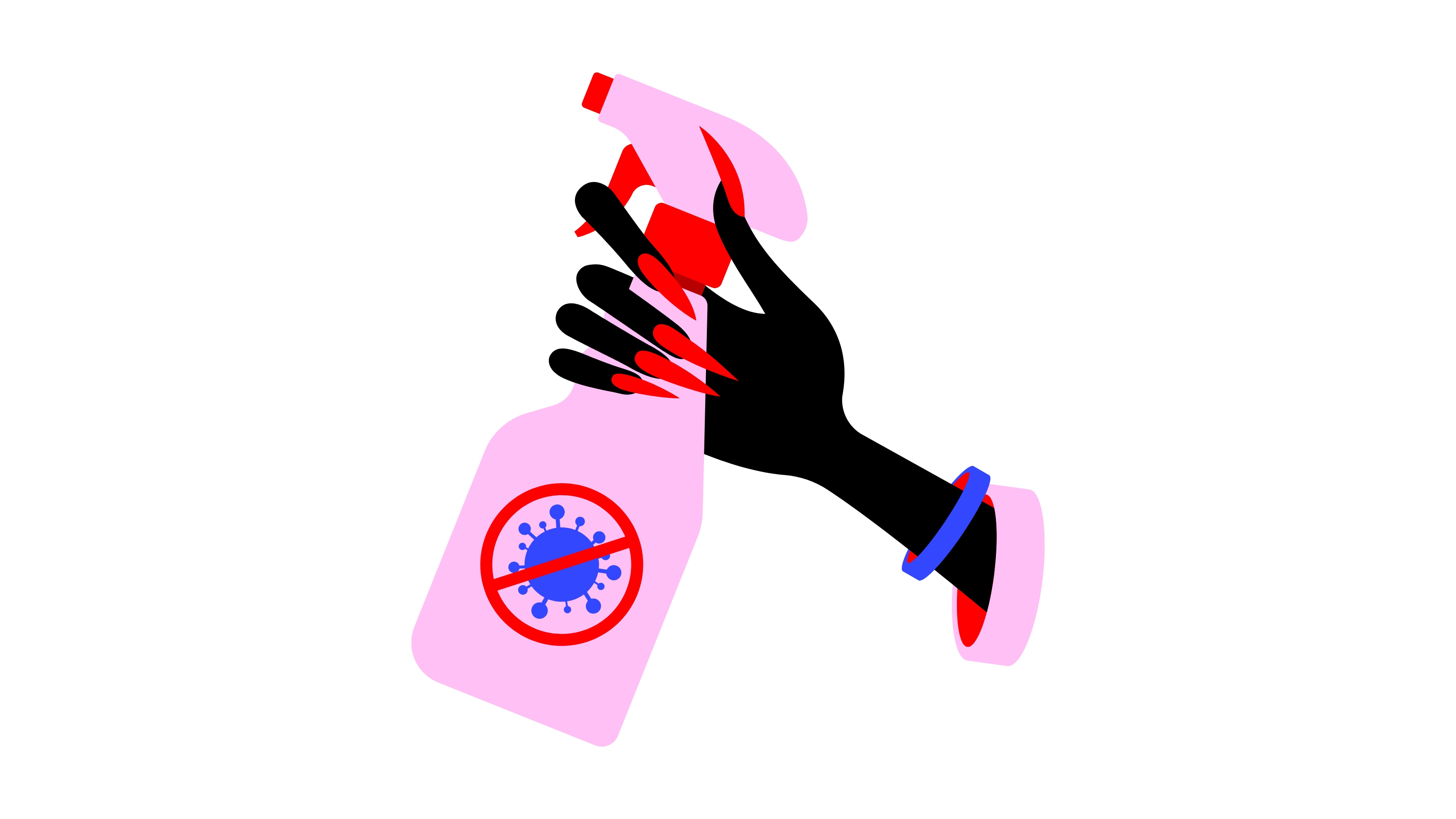
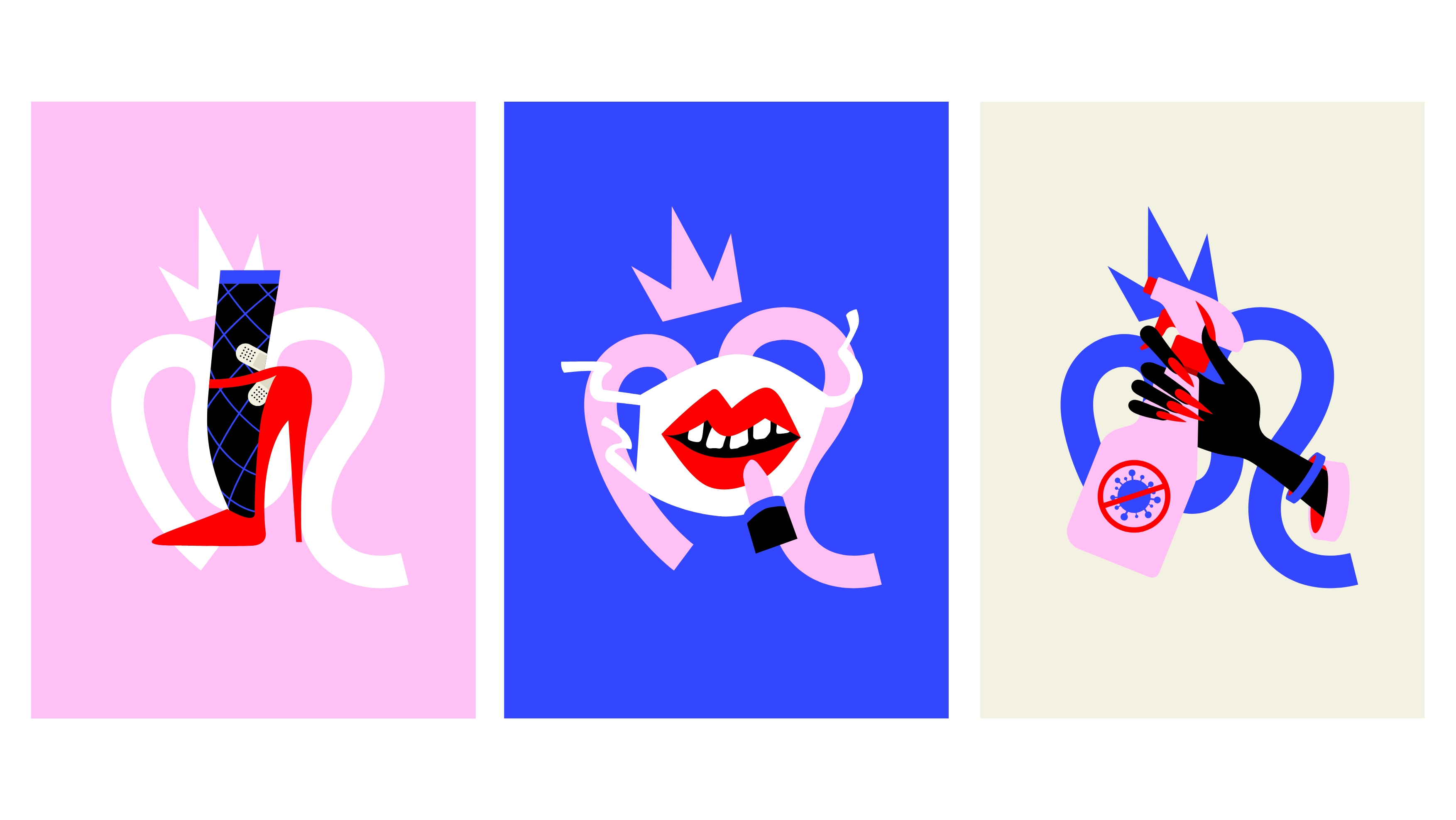
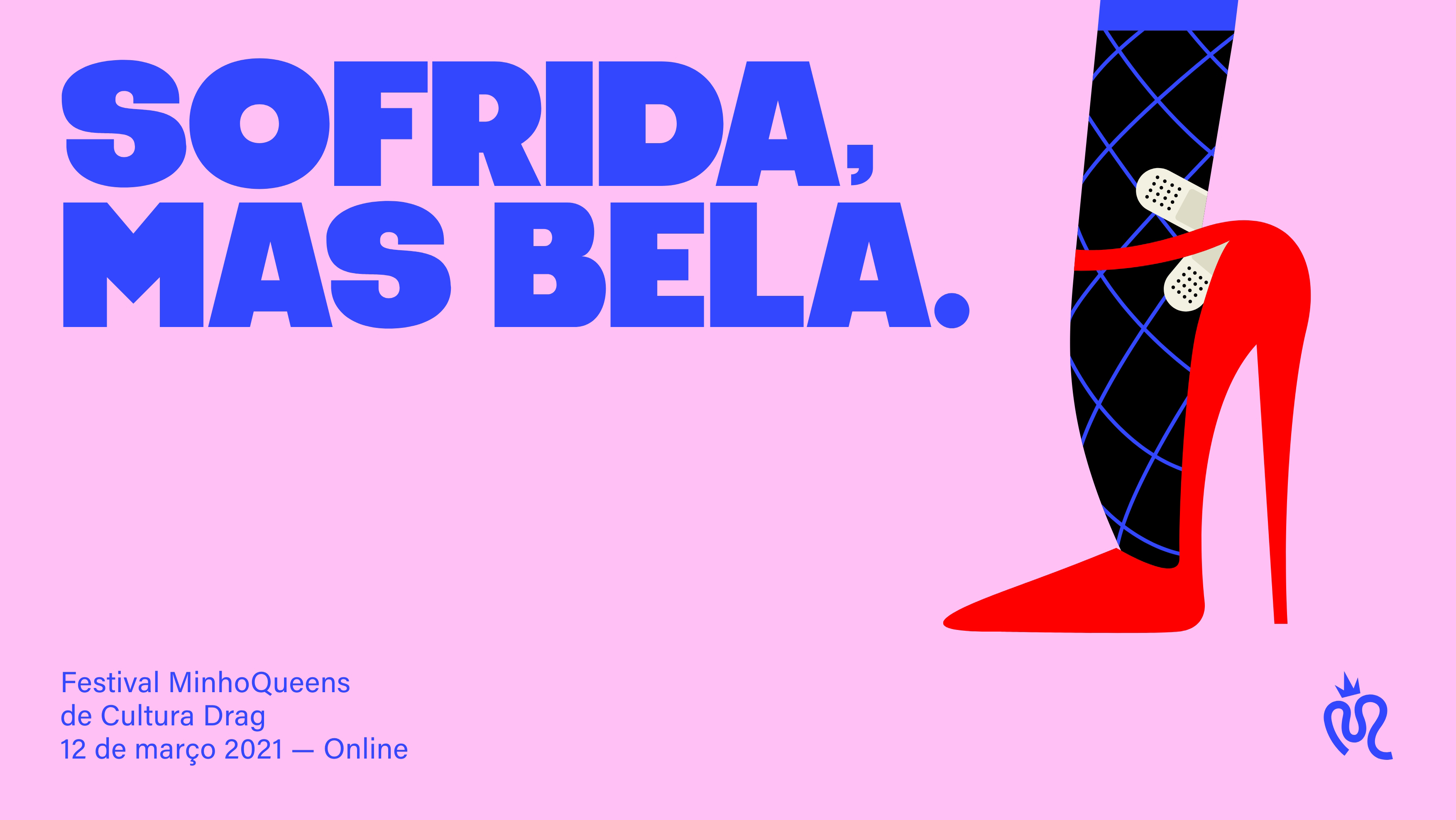
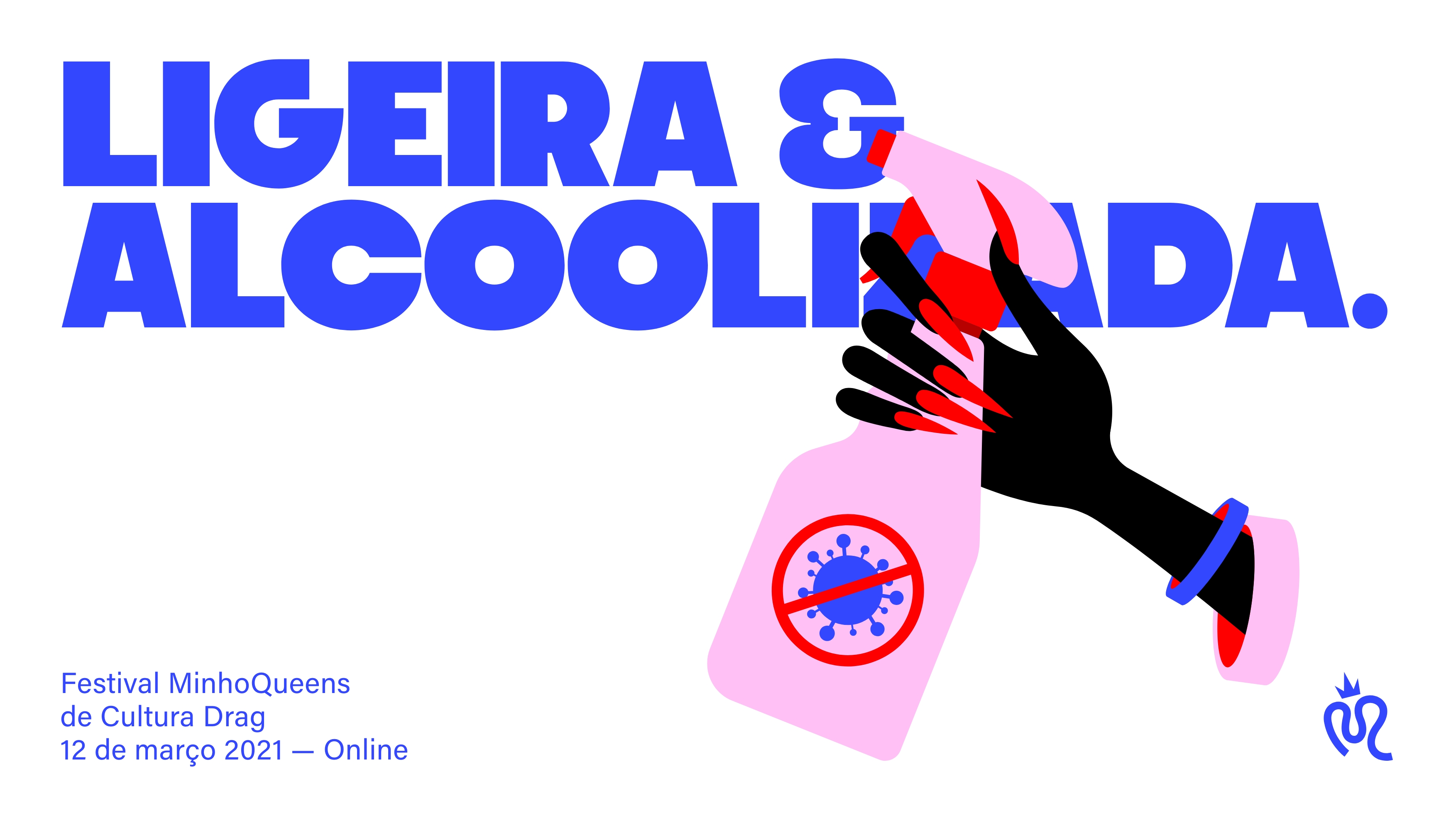
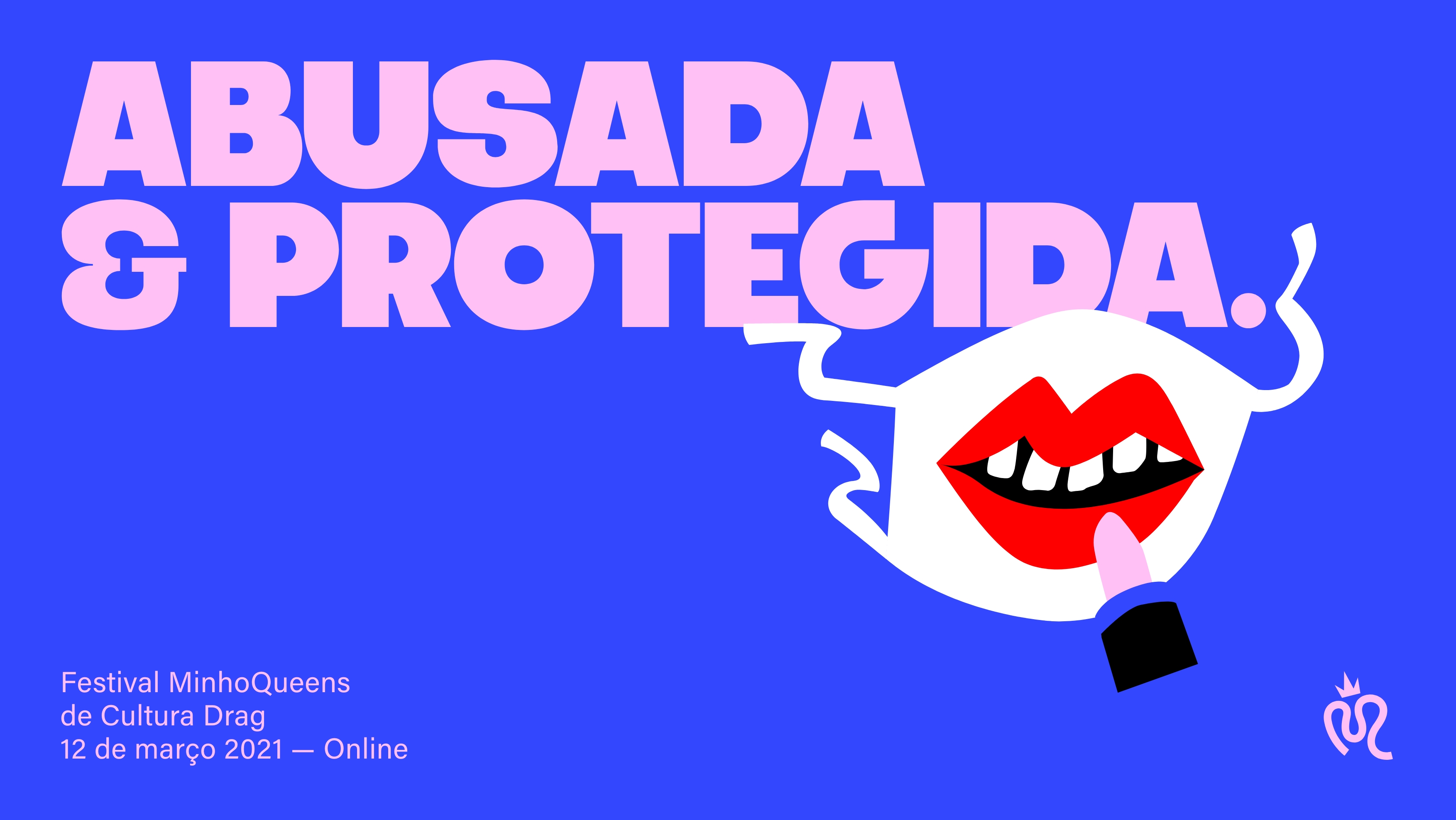
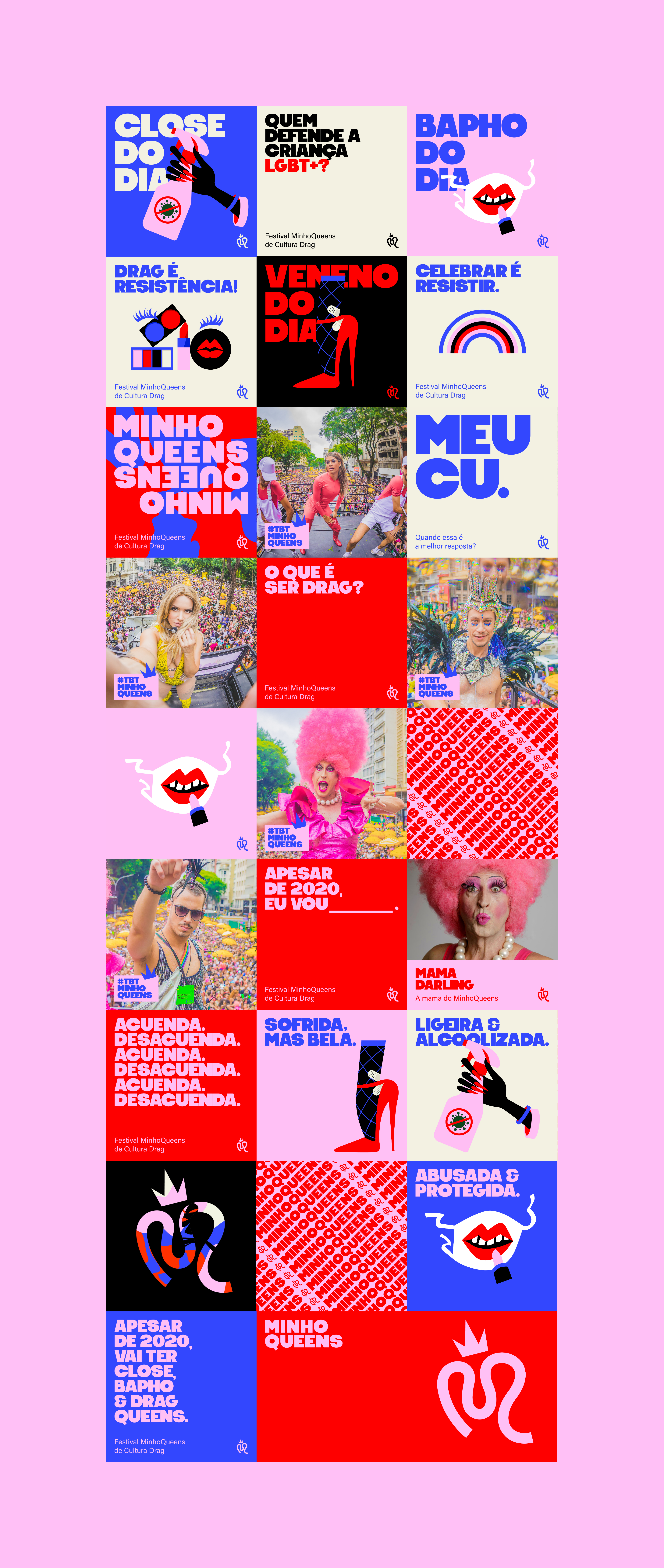
Minhoqueens is a Brazilian LGBTQIA+ collective. It’s known for organising iconic carnival parties for its community, filling the streets of Sao Paulo with crowds and diversity. During covid pandemic, the isolation pushed the collective to reinvent the experience as a whole. The challenge was a completely digital event, having drag queen art form as the base of the project. The spirit of the brand is irevent and graphic, having the colour palette inspired on the trans flag and the red on the fight against HIV. The logo’s shape refers to Minhocao, the location where the parties used to be. Minhocao means earthworm in Portuguese, that’s why the symbol is a visual interpretation of the of the mix M + Queen + Earthworm.
Services
Logo design
Visual identity
Illustration
Instagram design planning
Services
Logo design
Visual identity
Illustration
Instagram design planning
Brand elements
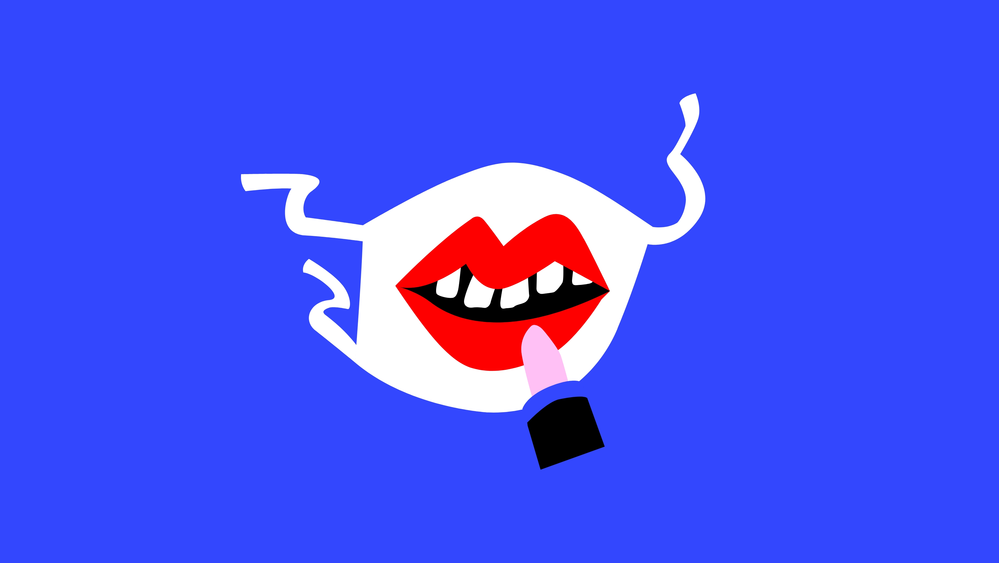
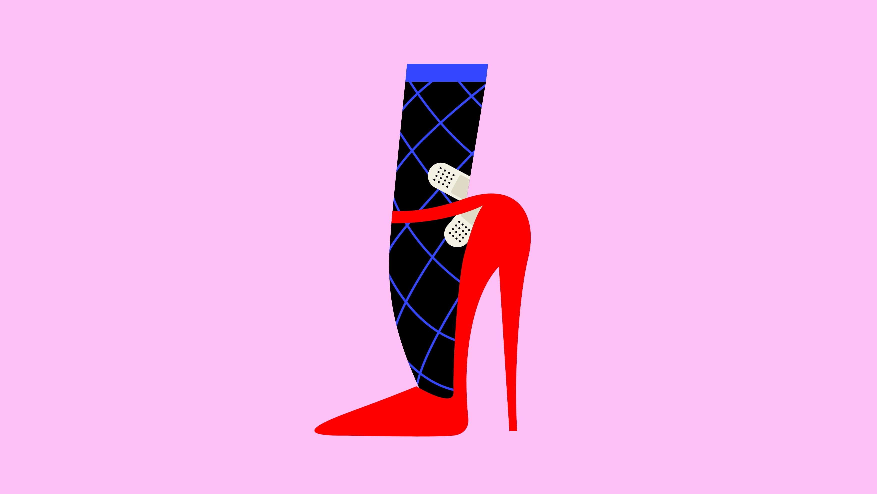
Illustrations
Communication
Event elements
